Introducing ProUnity’s New Brand Identity: Fair Forward Together
Today marks a new milestone in ProUnity’s history. We proudly unveil our fresh brand identity, a reflection of our remarkable journey and our boundless aspirations.
Unveiling Our new identity
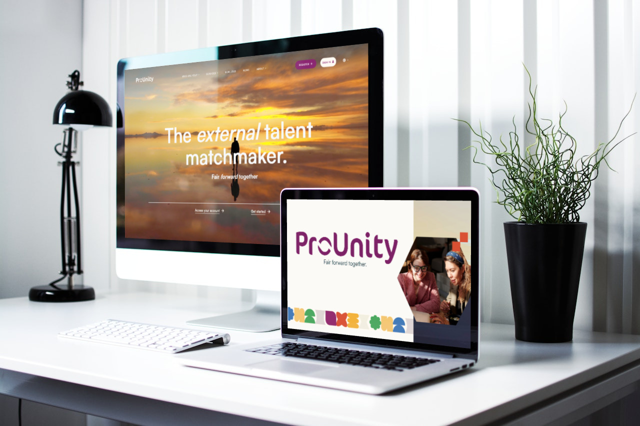
Our refreshed visual identity is now live across our website, communications, and rapidly further integrating into our platform and mobile app. We tip our hat to the exceptional designer Julie Lebrun, and our dedicated colleagues Julien Louis and Victor Miguel for their tireless efforts over the past months, bringing this vision to life in fresh designs and website pages, and to the talented independent visual artists (on Unsplash and Pexels) who shared their work to become part of our storytelling.
So, why Did We Rebrand?
ProUnity’s journey has been a story of growth and transformation. The adoption of our “Grow with us” slogan and our distinctive purple logo effectively communicated this standing as the fastest-growing player in the HR-Tech market.
In the meantime, we evolved from a thriving innovative scale-up to a mature and trusted market partner. We still challenge the status-quo but perform on a larger and more international stage, as part of Headfirst Group. This movement naturally led us to rebrand, reaffirm and strengthen our core mission: promote fairness in talent alignment, embrace the entrepreneurial spirit of corporate leaders, and foster seamless collaboration with our clients as an unstoppable team.
.png)
Confirming our Vision and Values
We went on a journey to define our core values, with the support of Springbok agency. ProUnity is collectively ambitious, perpetually innovative, pragmatic, and a caring company. As trusted partners, we bridge the gap between external talent and clients, and foster their collaboration, emphasizing the human touch and simplifying complex processes.
- Our Vision: Challenging matchmaking with technology and a personal touch to help clients align talent fairly and achieve sustainable growth.
- Our Mission: Passionately connecting external talent with top projects.
- Our Values: “Pro” stands for professionalism, experience, efficiency, and solution orientation, while “Unity” represents collaboration, respect, creativity, and group dynamics.
- Our Approach: We offer a modular and scalable service to enhance collaboration, with a robust VMS management platform, an open Marketplace, Broker and MSP support.
These ideas now form the core of our identity, reflecting the principles we uphold. It was high time for our external branding to mirror this newfound clarity and unity of purpose.
The new baseline: Fair forward together
Our rebranding journey is grounded in our “Fair forward together” baseline and manifesto. In a world where excellence, agility, and enthusiasm are paramount, we champion moving forward collectively, transcending boundaries and backgrounds, and nurturing a culture of fairness in all facets of our work. We believe that organizations must align talent based on fairness. As part of the HeadFirst Group, we also embrace the entrepreneurial spirit of corporate leaders, driving results and sustainable growth through collaboration, working closely with our clients as one cohesive team.
.png)
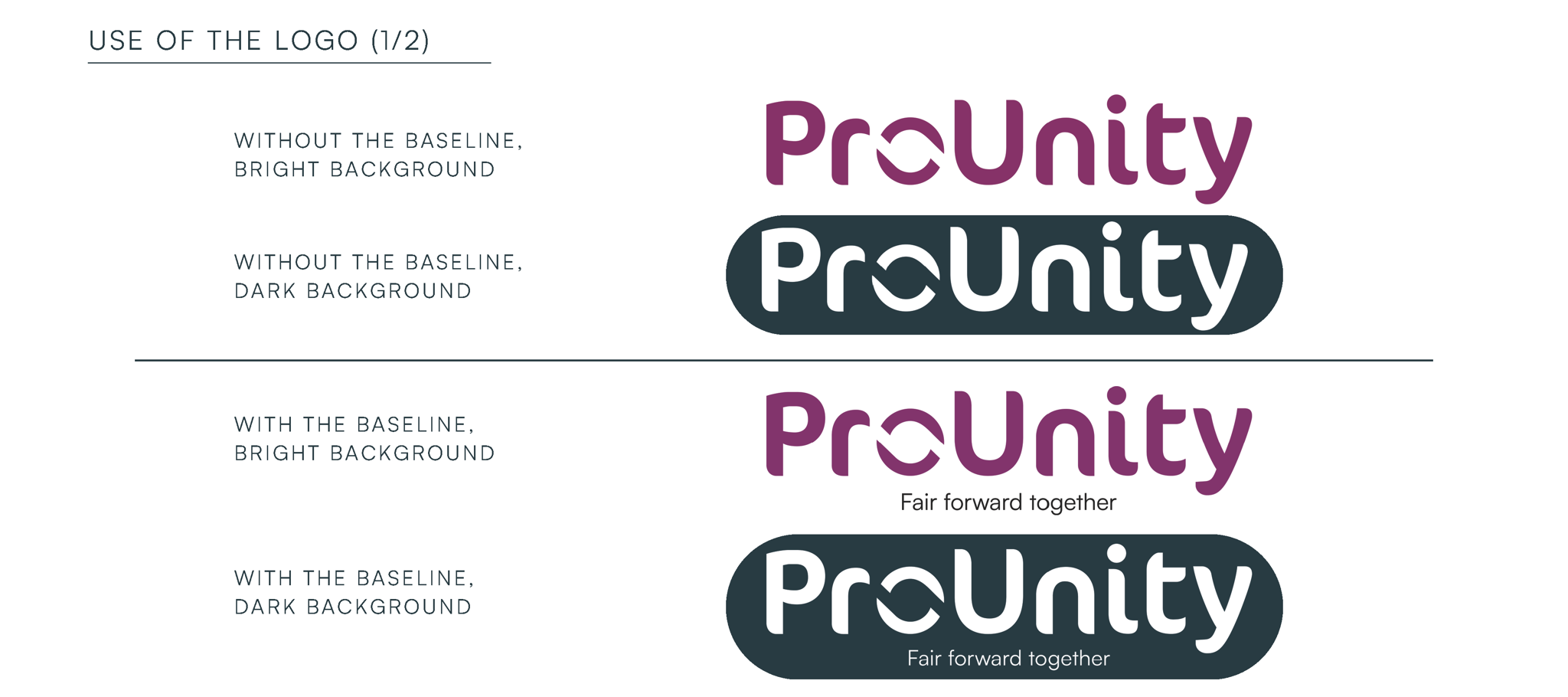
The ProUnity logo and colours
Our logo combines the rounded Cocon-font, representing our human touch, with the sharper ‘O’ reflecting the dynamic interplay between client and talent, tech and touch, moving swiftly within ProUnity’s “talent wheel.” We complement this with the Satoshi font, a modernist sans serif type family, perfect for fresh and dynamic online and print content.

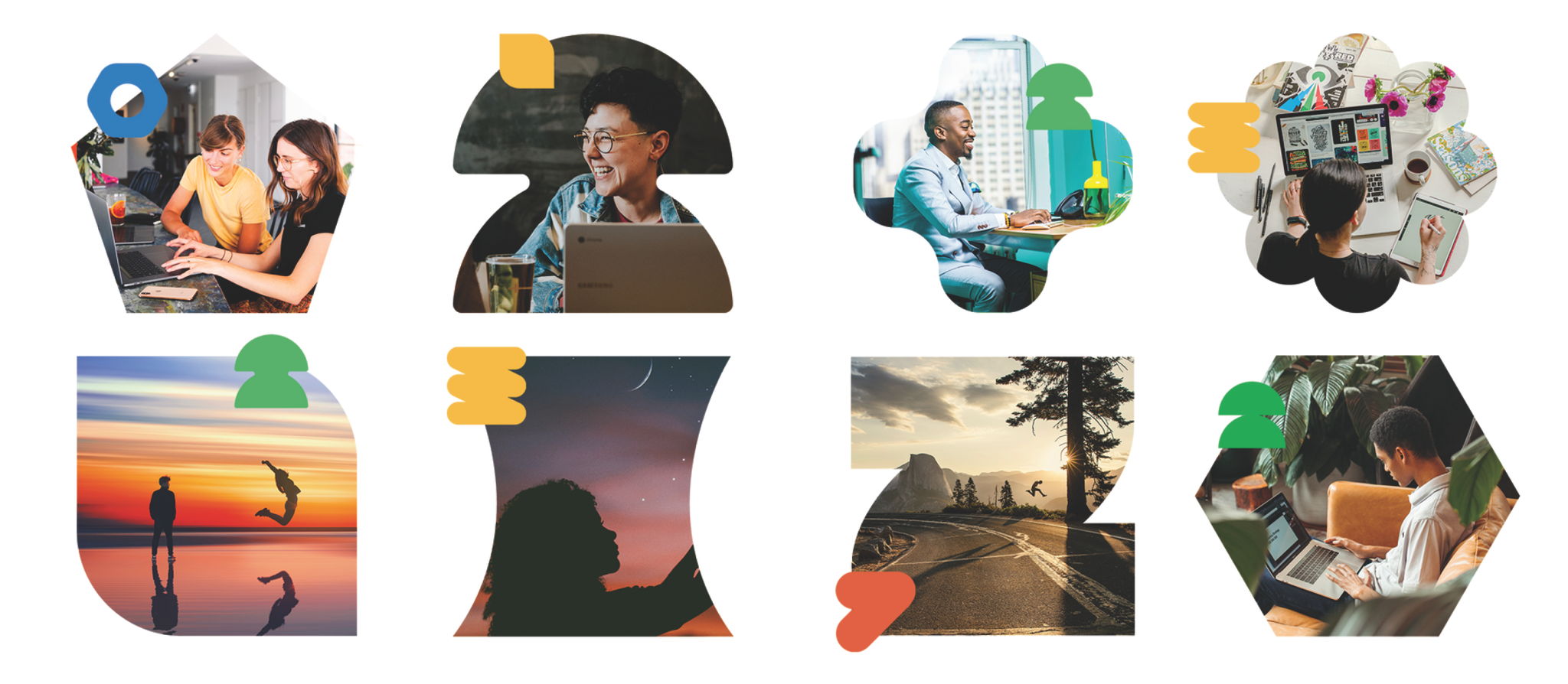
Icons, and Symbolism
By combining images with abstract icon shapes in these four colours, we create a dynamic and multi-layered visual experience, emphasizing only talent matters, not appearance.
Plus, an updated product
While the core functionality of ProUnity’s VMS + Marketplace + MSP support remains unchanged, it now aligns seamlessly with our new brand colours and designs on the VMS platform and mobile app. Simultaneously, ProUnity’s in-house development team has tirelessly enhanced ProUnity’s product, introducing new features, and adding the mobile app for platform users. They never stop refining the user interface, ensuring everyone feels at home using our platform.
What’s next for ProUnity
This brand transformation is more than just aesthetics; it underscores our dedication to our mission. As ProUnity’s influence continues to grow across borders and industries, this new identity sets the stage for new ventures, and for further challenges to be met together with our fantastic clients, freelancers, and suppliers.
It also reaffirms our commitment to a world that values fairness, progress, and collaboration. As we advance together, we invite you to join us on this thrilling journey, and why not, send us your feedback on our new branding.
Let’s go fair forward together.
